
Signage: Best Practices and Common Mistakes
Effective signage is crucial for businesses and public spaces, ensuring messages are noticed and understood. This comprehensive guide explores essential design principles for creating impactful signage, focusing on best practices and common mistakes to avoid. Whether you’re designing outdoor signs or in-store displays, these insights will help you craft signs that capture attention and convey your message clearly.
Introduction: The Importance of Effective Signage
Signage plays a pivotal role in communication, guiding, informing, and influencing audiences. Well-designed signage can enhance brand visibility, improve customer experience, and drive engagement. However, poor design can result in missed opportunities and confusion.

What Makes Signage Effective?
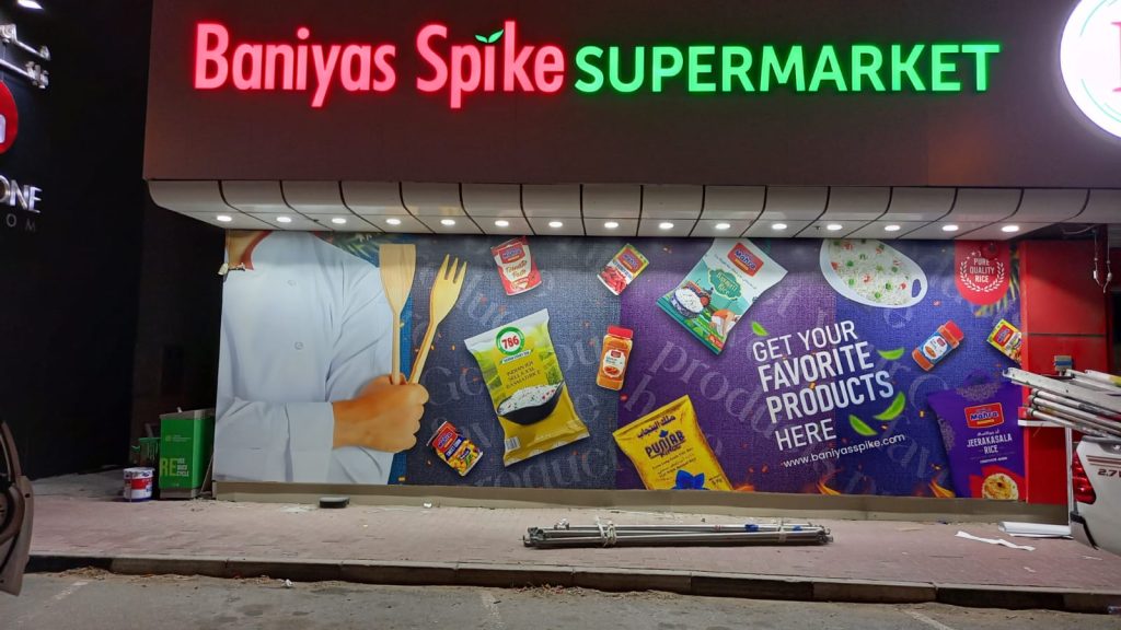
- Visibility: Effective signs are easily noticeable and readable from a distance.
- Clarity: Clear, concise messages ensure quick understanding.
- Aesthetic Appeal: Attractive design elements draw attention and leave a lasting impression.
Best Practices for Designing Effective Signage
Adhering to best practices in signage design ensures your messages are impactful and efficient.
Use Bold and Readable Fonts
- Font Selection: Choose clean, sans-serif fonts for better readability.
- Size Matters: Ensure text size is appropriate for the viewing distance.

Optimize Color Contrast
- High Contrast: Use contrasting colors between text and background to enhance readability.
- Brand Colors: Incorporate brand colors strategically while maintaining readability.
Incorporate Simple and Clear Messaging
- Concise Text: Limit the amount of text to essential information.
- Action-Oriented Language: Use verbs and direct language to prompt action.
Strategic Placement and Sizing
- Location: Place signs where they are easily visible to your target audience.
- Size Appropriately: Ensure the sign size matches the viewing distance and location.

Common Mistakes to Avoid in Signage Design
Avoiding common pitfalls in signage design can significantly improve the effectiveness of your signs.
Overcrowding with Information
- Keep It Simple: Too much information can overwhelm and confuse viewers.
- Focus on Key Points: Highlight essential details and use bullet points for clarity.

Poor Font Choices
- Avoid Fancy Fonts: Decorative fonts can be hard to read.
- Ensure Legibility: Stick to easy-to-read fonts, especially for important information.
Ignoring Viewing Distance
- Consider Distance: Design with the intended viewing distance in mind to ensure readability.
- Test Visibility: Check visibility from different angles and distances.
Inadequate Contrast and Color Choices
- Avoid Low Contrast: Ensure there is a clear distinction between text and background.
- Color Blindness Considerations: Use color combinations that are easily distinguishable by all viewers.
Enhancing Outdoor Signs: Specific Considerations
Outdoor signs face unique challenges such as weather conditions and varying light. Here’s how to optimize outdoor signage design.
Weather-Resistant Materials
- Durable Materials: Use materials that can withstand harsh weather conditions.
- UV Protection: Ensure signs are resistant to UV rays to prevent fading.
Illumination for Night Visibility
- Backlighting and Front Lighting: Use appropriate lighting techniques to ensure visibility at night.
- Solar-Powered Options: Consider eco-friendly solar-powered lighting for sustainability.
Conclusion: Crafting Impactful Signage
Effective signage design combines readability, aesthetic appeal, and strategic placement to create impactful messages. By following best practices and avoiding common mistakes, you can ensure your signs stand out and communicate effectively.
For more insights on creating impactful signage and other design projects, read other blogs and visit our project portfolio. Explore how effective signage can transform your communication strategy today.