
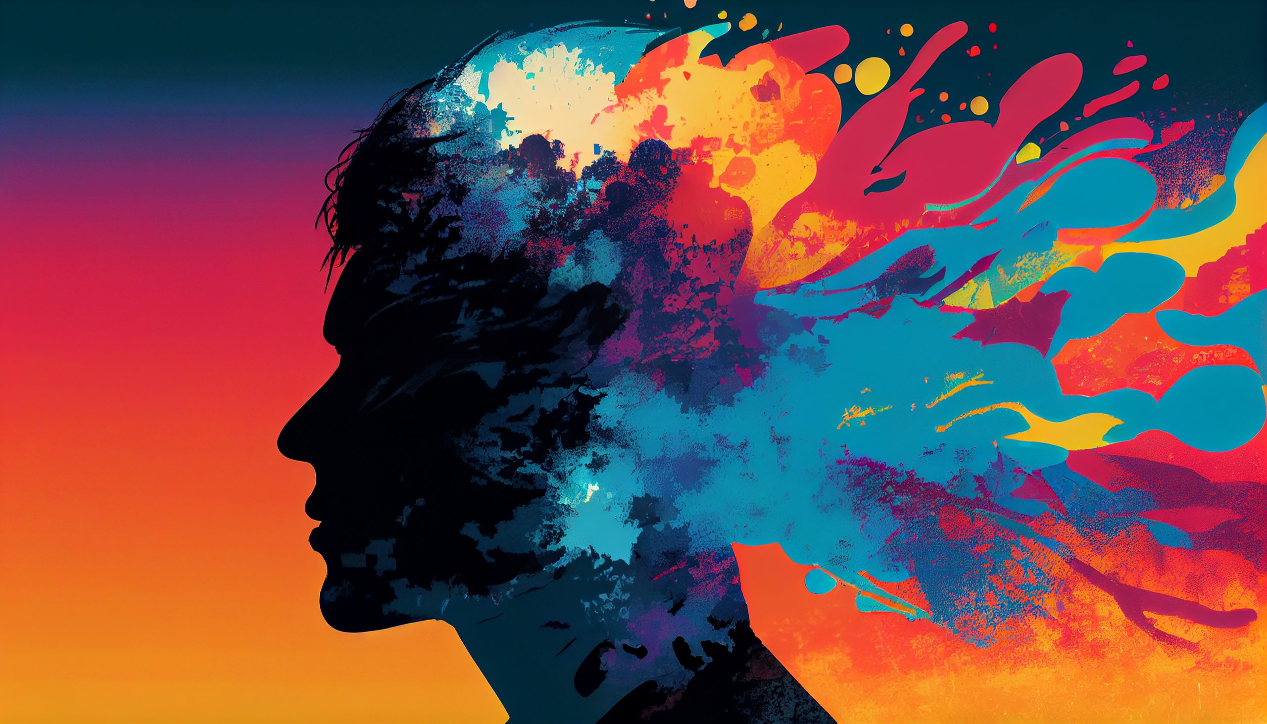
Color Psychology in Branding: How Colors Influence Emotions
Colors;
- Red – Passion & Energy
- Blue – Trust & Stability
- Green – Growth & Health
- Yellow – Optimism & Warmth
- Black – Elegance & Sophistication
- Orange – Creativity & Playfulness
- Purple – Luxury & Royalty
- Brown – Reliability & Earthiness
Have you ever wondered why certain logos, advertisements, or brand designs evoke specific emotions or feelings? The answer lies in the fascinating world of color psychology. Whether you’re a designer, marketer, advertiser, or a business owner aiming to create a compelling brand, understanding how colors influence emotions and connections is crucial.
The Power of Colors
Colors are more than just aesthetics; they are a language. They have the remarkable ability to communicate and resonate with us on a deep, emotional level. Let’s dive into how different colors can impact our perceptions and how savvy marketers and designers use this knowledge to create meaningful brand connections.
Red: Passion and Energy

Red is the color of passion, energy, and excitement. It’s a bold choice that grabs attention and conveys a sense of urgency. Brands like Coca-Cola and Netflix use red to stir up enthusiasm and action in their audiences.
Blue: Trust and Stability

Blue is synonymous with trust, stability, and reliability. Companies like IBM and Facebook leverage blue to establish confidence and reliability in their products and services. Blue is a calming and reassuring color.
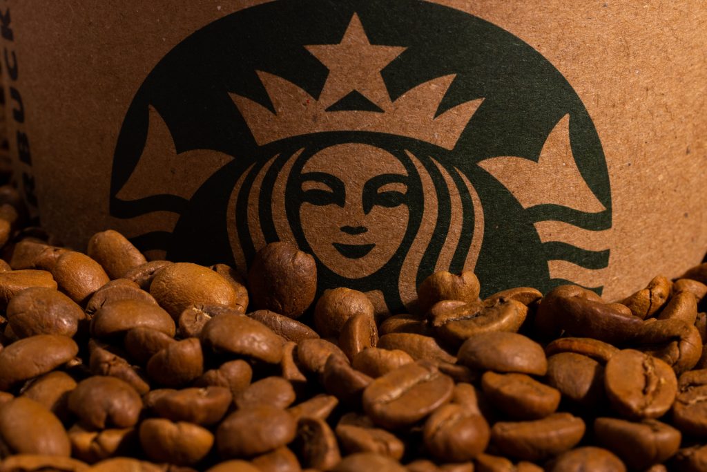
Green: Growth and Health
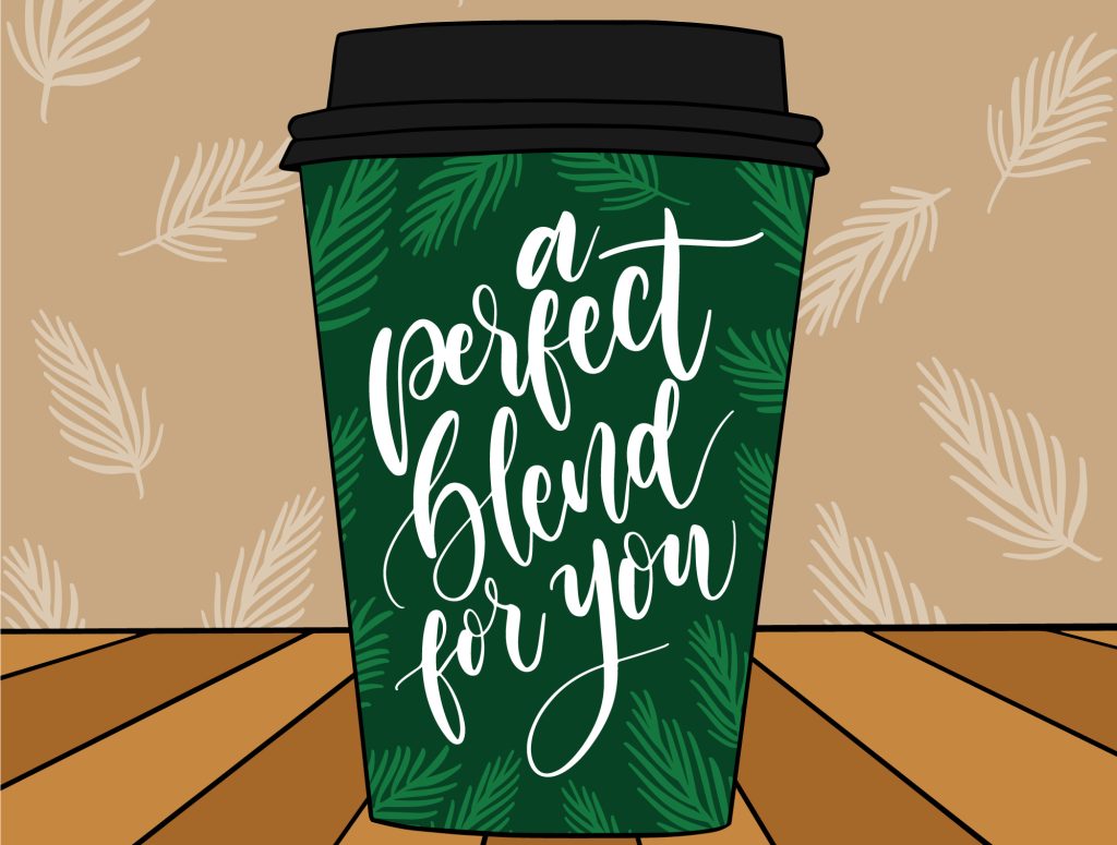
Green represents growth, health, and nature. It’s commonly used in industries related to health, organic products, and sustainability. Brands like Starbucks and Whole Foods embrace green to symbolize wellness and a connection to the environment.
Yellow: Optimism and Warmth
Yellow is the color of optimism and warmth. It radiates positivity and happiness. Brands like McDonald’s and Ikea use yellow to create a cheerful and inviting atmosphere, welcoming customers with a smile.
Black: Elegance and Sophistication

Black exudes elegance and sophistication. It’s often associated with luxury and exclusivity. Brands like Chanel and Mercedes-Benz opt for black to convey a sense of prestige and high-quality offerings.
Orange: Creativity and Playfulness
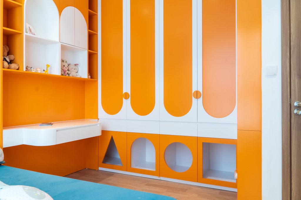
Orange is the color of creativity and playfulness. It’s used by brands like Nickelodeon and Fanta to appeal to a younger, more vibrant audience. Orange is all about fun and innovation.
Purple: Luxury and Royalty

Purple is linked to luxury, royalty, and creativity. It’s a captivating color used by brands like Cadbury and Hallmark to add a touch of elegance and exclusivity to their products.
Brown: Reliability and Earthiness
Brown conveys reliability and a sense of being grounded. It’s often seen in brands related to outdoor activities, such as Timberland and UPS. Brown symbolizes trustworthiness and a connection to nature.
Putting It into Practice
Understanding the psychology of colors is one thing; applying it to your branding strategy is another. Effective use of color can create powerful and lasting connections with your audience. It’s about choosing colors that align with your brand’s personality, values, and the emotions you want to evoke in your customers.
So, the next time you’re working on branding or design, remember that color goes beyond aesthetics. It’s a powerful tool for influencing emotions and creating lasting connections.
Eager to explore more about the world of branding and design? Check out our other blog posts and dive into our latest projects on our website: www.sgauae.ae.
Understanding the psychology of color is just one step in creating a compelling brand story. Embrace the world of colors and let your brand’s personality shine through.